


The start of autumn brings in more than just cozy sweaters and falling leaves. For many businesses, it’s a key moment to roll out fresh marketing. Whether you’re running a fall sale, a seasonal event, or launching a new product, the look and feel of your print materials can leave a big impression. And one of the small but important choices to make is picking between a glossy or matte finish.
At first glance, it might seem like a minor detail. But the finish of your print actually changes how people see and feel about your brand. The glossy vs matte finish decision can affect everything from how your colours appear to how easy it is to read your message. Let’s look at the differences and figure out what might suit your autumn promotions best.
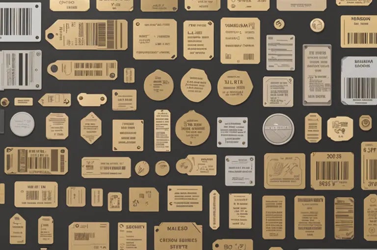
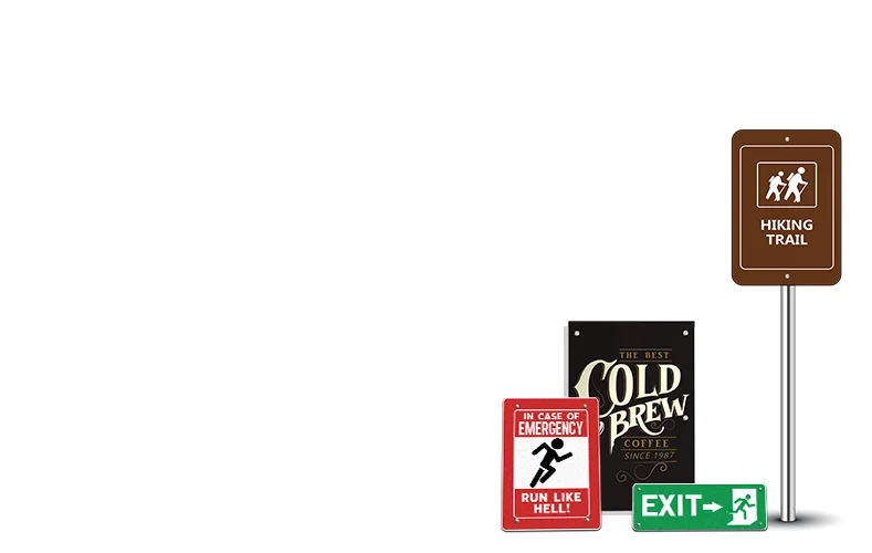
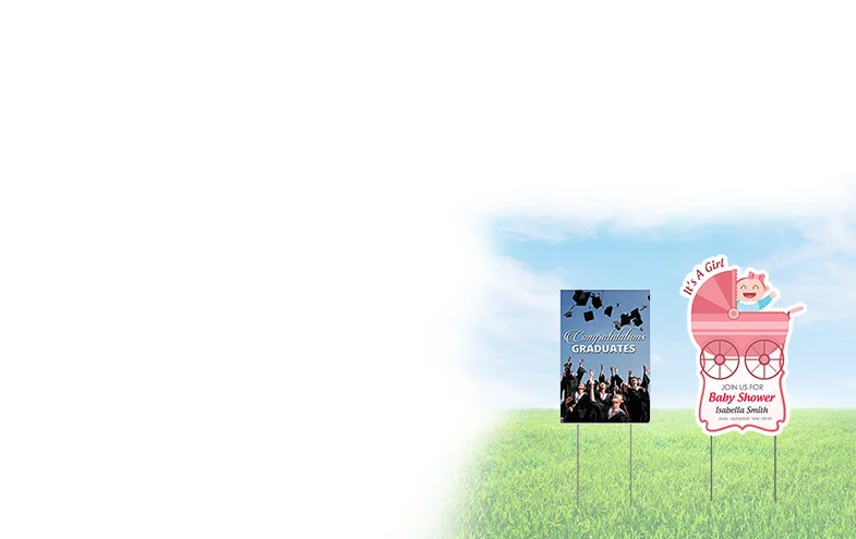
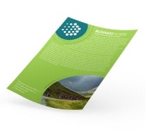
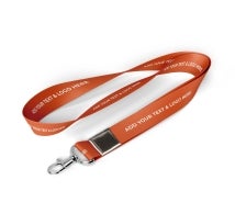
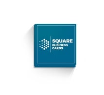
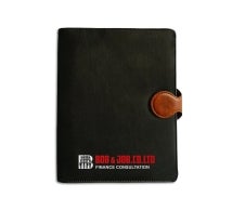
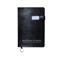
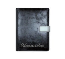
Popular Products
So, What’s the Real Difference?
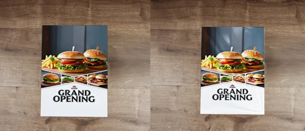
Glossy prints are shiny. They reflect light and give your colours a bold, vibrant look. Imagine those eye-catching photos and glossy magazine pages. Matte, on the other hand, has no shine. It is soft and smooth to touch, with a flat finish that gives off a more subtle, natural vibe.
For early autumn, when people are easing into cooler weather and new routines, this choice matters. If your message is loud and urgent, glossy might help it stand out. If it’s warm and comforting, matte could be the better fit.
Consider the Tone of Your Campaign
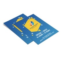
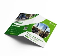
Every campaign tells a story. Is yours about big savings or cozy gatherings? For example, if you are designing custom pamphlets for a community fall fair, a matte finish might feel more in line with the season’s earthy tone. However, if you’re promoting a clearance sale with bright colours and bold fonts, a glossy finish could make everything pop just the right way.
There comes the question: How to choose between matte and glossy finish? The answer lies in what you want people to feel when they see your material. Are you aiming for something that looks sleek and polished or warm and inviting?
Choosing the Right Finish Based on Colour
Yes, it does. Glossy paper tends to make colours appear deeper and brighter. It adds contrast and can make graphics and photos look more lively. So, if your design includes rich reds, oranges, or bold images, a glossy surface might bring them to life in a noticeable way.
But if your content is more text-heavy or features soft autumn tones like beige, rust, or mustard, matte can help keep things easy to read and pleasant to look at. Choosing the best paper finish for fall promotional materials depends on how your colour palette behaves under different lighting conditions.
Picking the Best Finish for How You’ll Use It
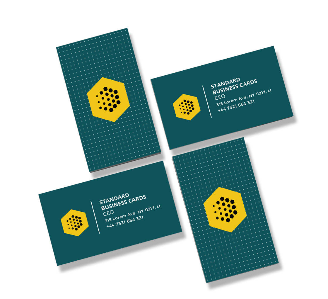
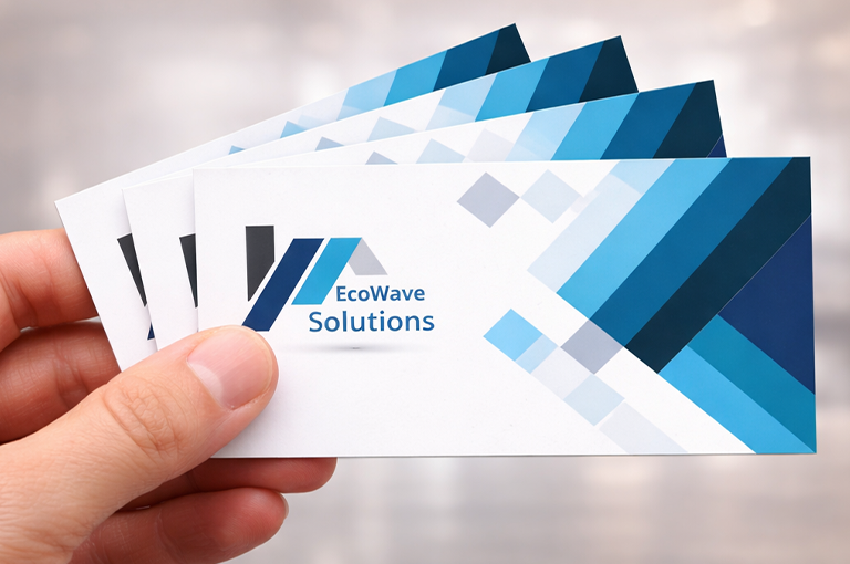
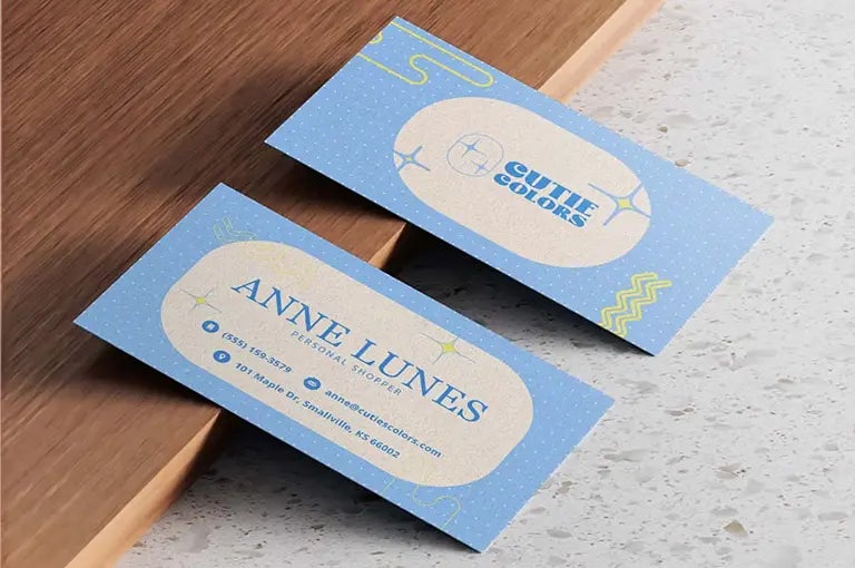
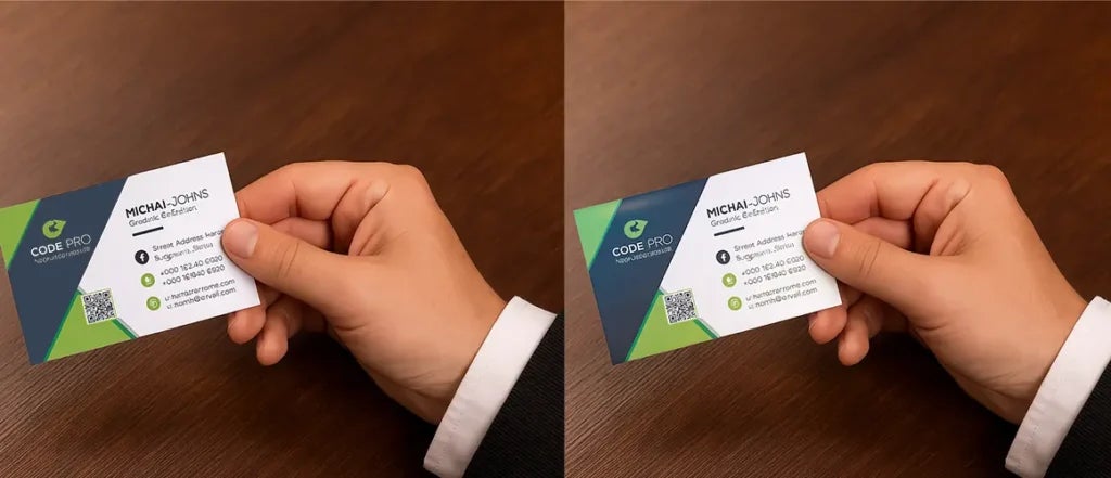
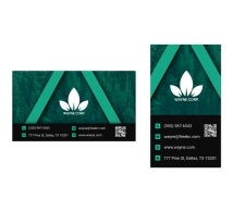
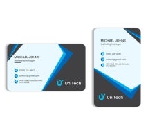
This one is easy to overlook, but super important. Let’s say you are printing custom business cards to hand out at a networking event. If you go with a glossy finish, they’ll stand out with a shine. But they might be harder to write on if someone wants to jot down a note.
Matte cards, on the other hand, feel smoother and are easier to write on with any pen. That small detail can make a difference. If your cards are more for show, glossy could be fine. If they are going to be handled and written on, matte might be the smarter pick.
Matching the Finish with Viewing Conditions
If you are planning to use your prints outdoors, lighting and reflection will play a role. For instance, if you are putting up window decals at your storefront, a glossy surface will make colours pop but might cause glare. That glare can make it harder for people to read or see the details, especially when sunlight hits it.
A matte decal can solve that problem by offering better visibility with no shine. So when choosing for outdoor displays, test both finishes in natural light first. The right finish can help people actually see what you are trying to say.
The Role of Texture in Print Materials
One thing that’s easy to forget? Texture matters too. When people touch your marketing materials, they instantly form an opinion. Matte feels soft and smooth. Glossy feels slick and shiny. There is no right or wrong here, but it should match your brand’s style.
If you are printing custom pamphlets that people will flip through slowly, a matte finish might feel more relaxed and reader friendly. But for single-page flyers or menus that need to be noticed quickly, glossy could catch someone’s eye from across the room.
Read Also: The 4 Seasons of Marketing: Every Business Should Know
Which Finish Grabs Attention Faster?
That’s a common question: Which paper finish attracts more customers? It really depends on the situation. Glossy finishes are great at grabbing attention, especially when light hits them just right. They are ideal for visuals, logos, and bold graphics.
But matte finishes offer something glossy can’t: a soft, almost premium look that feels thoughtful. For autumn campaigns, that subtle touch can be just as powerful, especially when you’re trying to build trust or create a relaxed experience.
Choosing the Right Finish for Mobile Promotions
Planning to take your promotion on the road? Maybe you’re using a car sticker to advertise an event or brand on your vehicle. Glossy stickers are a solid pick here. They reflect light, making them visible from a distance. Moreover, they are easier to clean, which is helpful if you are on the go.
But if your sticker has a detailed message or is mostly text, matte might keep things readable without the distraction of glare. Again, think about where it’ll be placed and what people need to see.
What’s the Right Fit for Your Brand?
Not every decision has to be complicated, but it should be thoughtful. Whether you are printing custom pamphlets, sharing your info through custom business cards, or decorating with window decals, the finish should match the feeling you want to create.
If your brand leans fun and colourful, glossy can add energy. If it leans simpler and more natural, matte can keep it grounded. Ask yourself, what would your customers expect to see? What would feel right in their hands?
Conclusion
In the end, choosing between glossy and matte isn’t about picking the better option. It’s about picking the right one for the job. Both finishes have their place. Early autumn is a time when people notice changes all around them. Your prints should match that mood.
Whether it’s a window decal, a shiny car sticker, or a clean-looking custom business card, the right finish helps your message come through clearly. So, think about your story, your audience, and your goals. The right choice is usually the one that feels the most like your brand.